The 2023 MLB season has now come to a close which means there is no longer any baseball to watch or write about. While the hot stove and offseason trades are interesting and fun to talk about, I figured I'd take this time to write about something that I probably care way too much about: uniforms. You know the saying "Look good, feel good. Feel good, play good." And I would hope that most fans at least care a little about what their team looks like when they run out on the field.
The Washington Nationals have had multiple evolutions in their uniforms in the short time the team has been in DC. There have essentially three phases of the Nats' uniform: the block script phase from 2005 to 2010, the upper left chest curly "w" phase from 2011 to 2019, and the post World Series cursive script phase from 2020 to current day.
Throughout these phases we have seen the addition and subtraction of some of the teams logos. From phase 1 to phase 2 we saw the team completely ditch the "DC" logo that was once on hats and jerseys. Now we've seen the addition of the capital block "W" logo which seems to be being used more and more each season since it was introduced. Could the Nationals possibly be trying to phase out the curly "W" and get away from the constant allegations thrown from opposing fans that the Nats stole their logo from Walgreens?
White Home Uniforms

Rating: 5/10
The new script white uniform seems to be the Nationals' new primary for home games. Overall I really love the script across the chest as opposed to just having the curly "W", but the thing that really makes me dislike these uniforms is the hat that is worn with them. I have never been a huge fan of any tri-colored hat for an MLB team. I tend to think that simple is usually better and much more timeless (e.g. Yankees, Dodgers, Mets) and the Nats already have this with their red caps. Something as simple as just replacing the current hat with the red curly "W" (Which they did some in 2020 and 2021) would make me rate this uniform closer to a 9/10. The block "W" capital logo is cool but in my opinion suits the Nats better as a secondary logo, maybe used for a patch on the sleeve. We won the World Series in the curly "W", I'm not sure why it's being pushed to the side.
Blue Alternate Uniform

Rating: 9/10
How can you not love the alternate blue uniforms? Much like what I suggested for the white uniforms, the blue alternatives utilize the teams main curly "W" logo on the cap, and go great with white or grey pants. The nostalgia from the 2019 is an added bonus as well.
City Connect Uniforms

Rating: 10/10
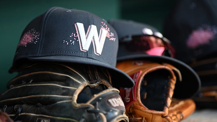
I might be a little biased but I believe the Nationals have the best City Connect uniforms released so far. The pink is not too flashy or egregious and still helps to convey the overall theme of the jerseys being cherry blossoms. The off-white pants go perfectly with the jersey and were something the Nats had never used in the past. Finally, the DC flag in grey and pink on the left sleeve brings the entire uniform together. While the block "W" really works well with these uniforms I think it is worth noting that they chose not to have a curly "W" anywhere on these uniforms, still a 10/10 in my opinion though.
Red Alternate Uniforms

Rating: 6/10
There's not much to say about the red alternative uniforms. Very simple, a curly "W" on the chest, a curly "W" on the cap, keep it moving. Overall, a nice switch-up from the white home uniforms from time to time but nothing special.
Away Uniforms

6/10
The Away uniforms are very simple as well. The script across the chest is nice and incorporates the curly "W". Very basic, but most away uniforms are. I'm not sure what I would change but also not sure what (if anything) I really like, thus the 6/10 score.
