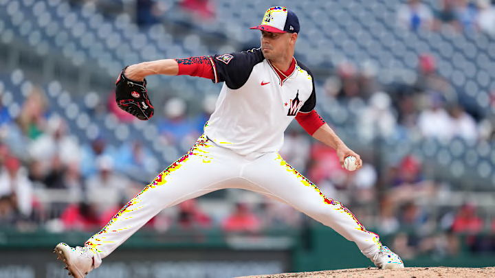
The Nationals finally debuted their new pullover jerseys on Sunday against the Blue Jays and I have to say, they are much better in action than initially presented prior to the season starting.
when we say New Jersey, this is what we mean pic.twitter.com/OwUb2cmi5H
— Washington Nationals (@Nationals) May 5, 2024
The idea of a pullover jersey was unique and new, so I was on board with that. My primary issue was, and still is, the logo. I think the block W in front of the Capitol building is easily the worst logo in Nationals history and is certainly their worst currently. The Nationals finally brought back the interlocking DC, and even incorporated it on the sleeve of these pullover jerseys, so between these and their primary curly W, there were just a lot of different logos and inconsistent branding. It might be nitpicky, but that is how I felt.
While I am being nitpicky, the lettering on the back of the jersey is small and does not look great, but that may be more of a Nike issue than a true design issue. Thankfully, Nike and the MLB have agreed to fix all of the issues surrounding MLB's uniforms, such as the small lettering and see-through pants. I'll withhold my full judgement on that aspect of the Nationals' pullover uniforms until I see the modifications that are made, likely next season.
In the grand scheme of things, an alternate logo is not that big of a deal, but I think just the block W (an homage to the Washington Senators, like they have been doing for the 100th anniversary of their 1924 World Series) would have been better. Or better yet, the full on reintroduction of the interlocking DC would have catapulted this uniform.
All in all, the Nationals have a pretty good combination of uniforms currently. The switch to the white script jerseys as their primary uniforms was excellent, and the navy scripts will forever be a classic after 2019.
With each new City Connect uniform to release, it makes me so much more happy that the Nationals got a good one. Not just a good one, but the best City Connect jersey in baseball. Debate a wall.

The Nationals' City Connect uniforms are so good that they are actually letting the visiting Baltimore Orioles wear their City Connect uniforms as well when the Nationals host the Orioles for a two game set starting tonight. It will be the first time since the City Connect uniforms were introduced that two opposing teams wore their City Connect uniforms.
Washington Nationals and Baltimore Orioles Announce “2024 BELTWAY SERIES: CITIES CONNECTED”.
— Nationals Communications (@NationalsComms) May 3, 2024
Both teams will don their popular City Connect uniforms during Game 1 of the Beltway Series presented by INOVA at Nationals Park on Tuesday, May 7. Learn more ⤵️https://t.co/XdVOIKURxE
The Nationals and Orioles will become the first MLB teams to wear their City Connect uniforms against each other
— MLB (@MLB) May 3, 2024
The Beltway Series: Cities Connected is set to take place next week, with both teams wearing their City Connect uniforms for Game 1 on Tuesday, May 7 pic.twitter.com/O8CjTzBXKI
The Orioles have some sweet uniform combinations as well, but their City Connect uniforms do not come close to the Nationals' combination. That will be on full display tonight. Regardless of how the series plays out, the Nationals are already up 1-0.
As far as the Nationals' pullovers go, while they are not my favorite, they are a good change of pace uniform for the Nationals to mix into the rotation every once in a while. And for the sake of being thorough, the road grays are fine. The changes they made to the road gray uniforms are not my favorite, but I will not lose sleep over road gray uniforms, nor should anyone else.
They always say, "Look good, play good." Well the Nationals certainly look the part, and it may be having an impact as the team sits at 17-17 through 34 games of the season, with a chance to go over .500 tonight for the first time since July 2021.
